Krimp app icon

Krimp

A climbing community and progress-tracking app

Type
Academic
Role
UX Designer
Features
Product Design, User Testing, Hi-Fidelity Prototyping

Overview

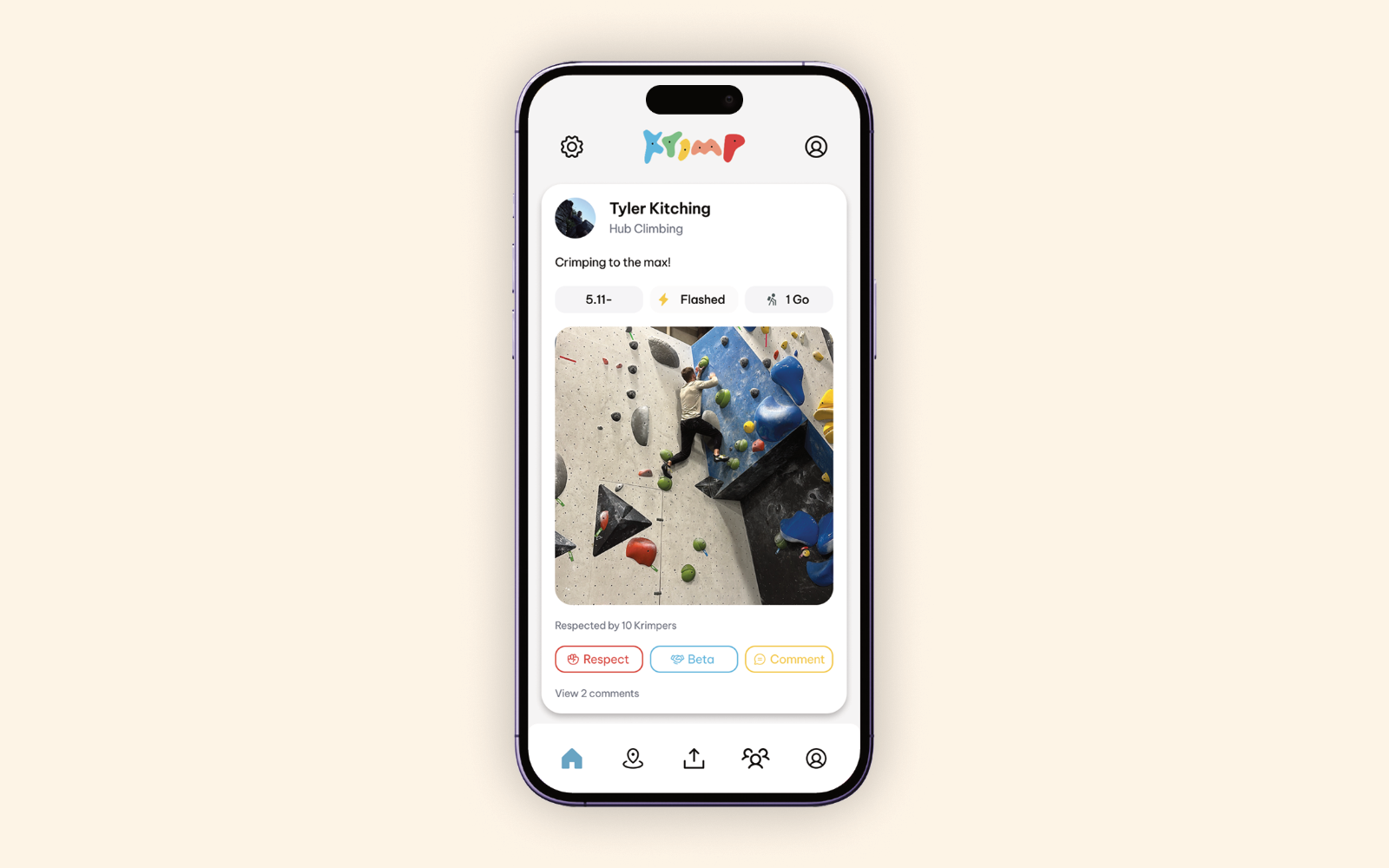
Krimp app overview

I designed a specialized space for climbers to share photos and videos of their sends, join local climbing groups, and discover nearby gyms. By combining performance tracking with community features, Krimp turns the solitary act of training into a shared social experience.
Problem & Approach

Climbing information is often fragmented across different tools and resources.

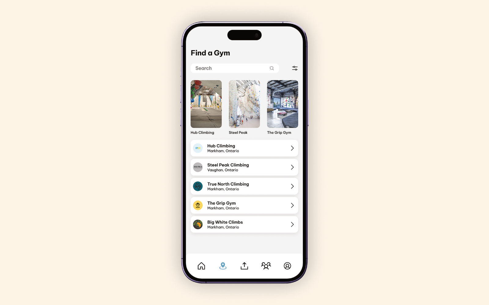
Krimp approach interface

Climbers often rely on a mix of traditional social media, group chats, gym websites, and personal notes to share progress and find local information. None of these spaces are designed around climbing language, grades, attempts, or the social dynamics inside a gym.

Krimp brings those disconnected activities into one focused experience, giving climbers a comfortable place to document sends, connect with others, and stay motivated.

The Experience

Krimp’s core flow follows a climb from the wall to the feed, keeping the details a climber cares about easy to record and review.

A climber records the grade, style, attempts, caption, and video before sharing a completed climb.

Interaction

Rock climbing has its own terminology and culture that can be difficult to capture on general social platforms. Krimp was designed by a climber, for climbers, with features that reflect how the climbing community communicates and shares experiences. Interactions like “Fist Bump” and “Beta” give users more meaningful ways to engage with posts, while clearly displayed climb grades help climbers of all skill levels find content that suits them.

Visual Design

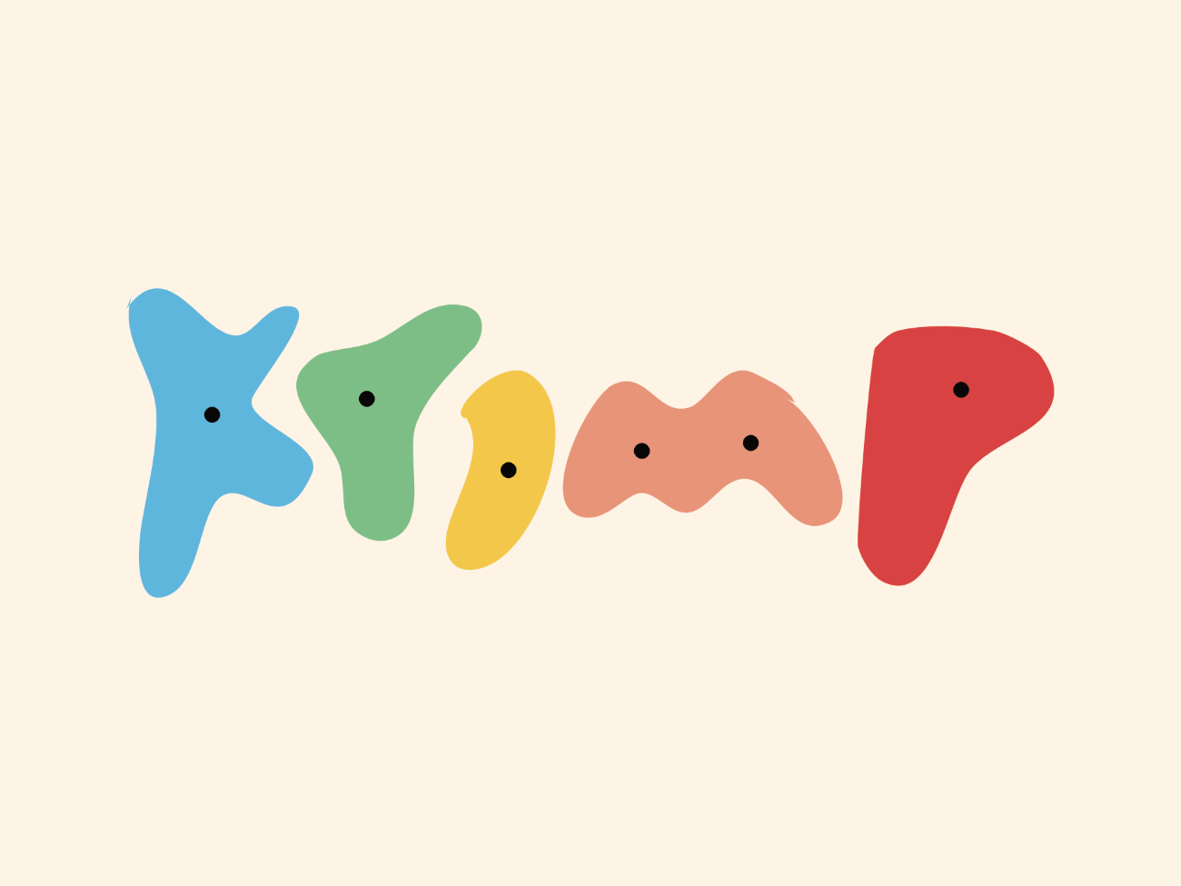
Krimp’s logo, colour palette, and overall visual style were designed to reflect the energy and movement of an indoor climbing gym. Climbing holds come in a wide variety of bright colours and distinctive shapes, creating a visual environment that feels both playful and dynamic. I wanted to bring that same sense of colour, variety, and fluidity into Krimp’s design, creating an experience that feels connected to indoor climbing rather than just another social platform. From the branding to the interface itself, these visual choices help capture the personality of climbing and make the app feel familiar to the community it was built for.

Krimp logo spelled out with colourful climbing holds

Design System

Krimp’s design system includes a variety of component states to support the different interactions throughout the app. I wanted to carry the look and feel of an indoor climbing gym into the interface, using vibrant colours and fluid shapes to reflect the environment. Feed interaction buttons often complement the bright colours found in climbers’ photos, helping the UI feel connected to its content. Rounded shapes and softer edges are used throughout the app to bring everything together, much like the different holds that make up a climbing wall.

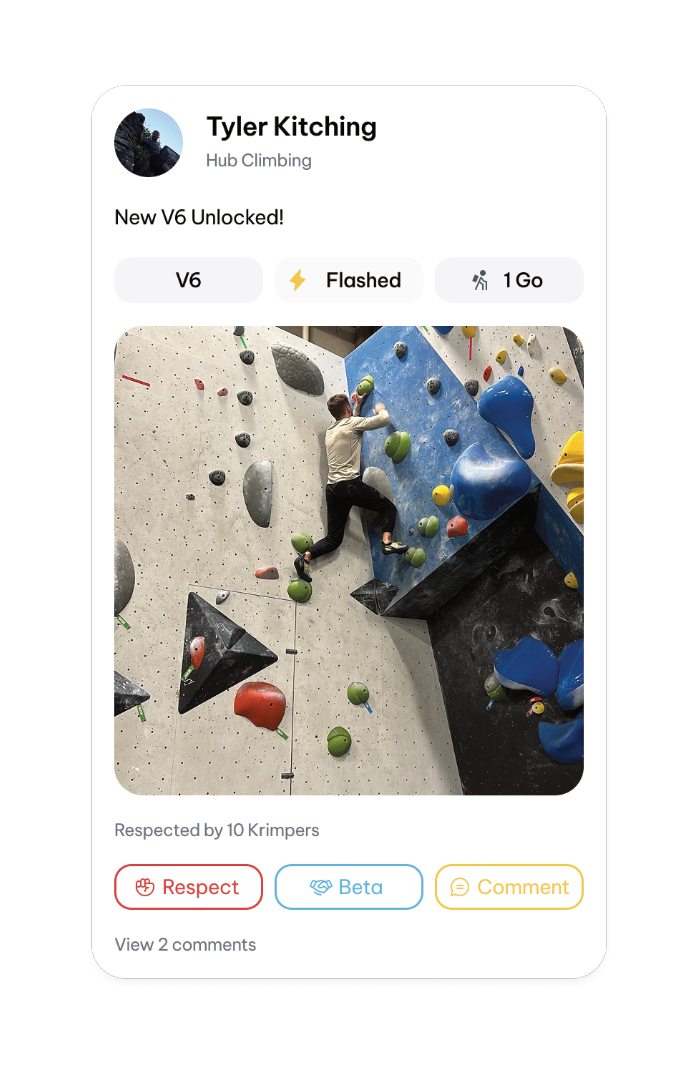
Feed post

Feed post

A completed climb post with grade and style badges, climb photo, and the Respect, Beta, and Comment actions.

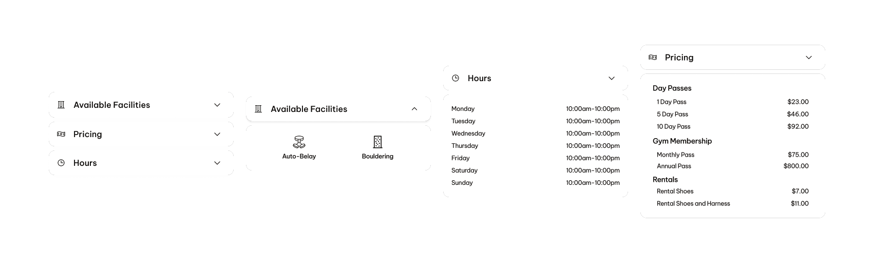
Gym information accordion

Gym information accordion

Collapsed and expanded states for a gym’s facilities, hours, and pricing.